Blog
How we created a logo for an internal platform
 Miller Rodriguez
Miller Rodriguez
Web DesignerAURA is an internal platform we use at axiacore to manage requests from our clients.
AURA's name comes from the abbreviation "Automated Unified Relationship Application." It is also the Greek goddess Aura's name, which means "the breeze."
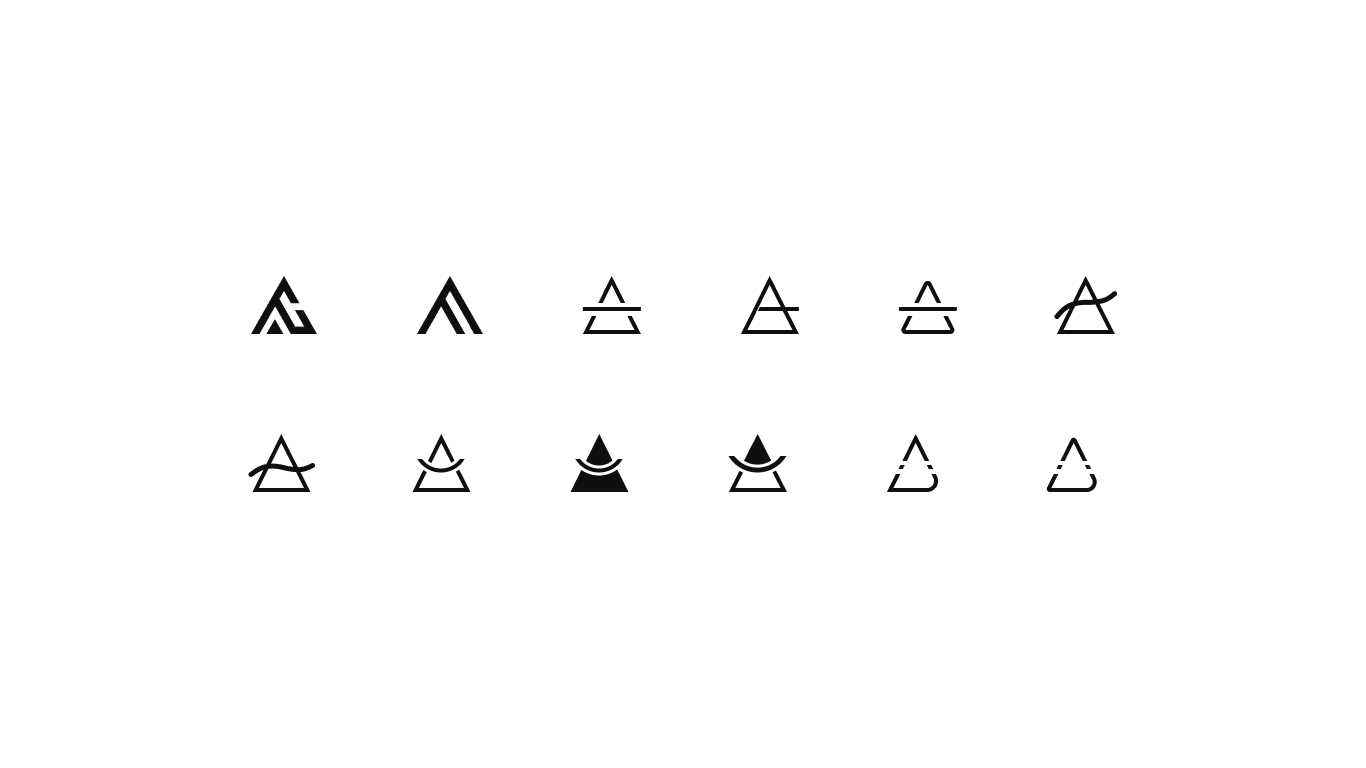
The logo is a mix of different symbols related to the meanings of AURA: the delta symbol (belonging to the Greek alphabet and linked to the Greek goddess Aura), the symbol for air in alchemy, and the concept of unification, which defines the sum of the previous symbologies in a single element.
After having the concepts clear, the initial sketching process was carried out to obtain some ideas.

By drawing out the main ideas, we choose the one closest to what we are looking for and start the digitization and iteration process.
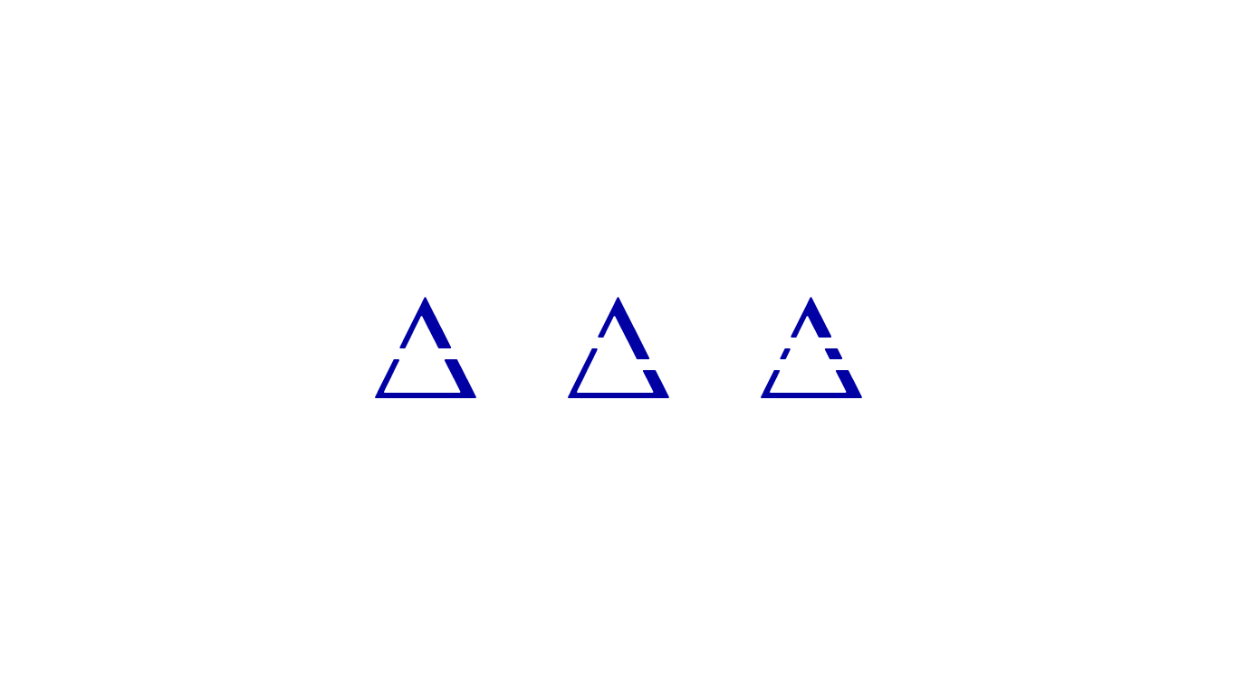
We made the last iterations to have three options and choose the one that best suits what we want to convey.
Finally, we are looking for a modern typography with a formal style to express friendliness, and by joining it with the element, there is a balance between the two parts.

Written by Miller Rodriguez
Miller Rodriguez
Miller crafts visually stunning and user-friendly websites. With a keen eye for design and a focus on usability, he creates engaging online experiences that align with clients' brand identities.
Subscribe to our newsletter here:
Learn how to use technology to get back your time and enjoy an empty calendar on a work day.
We respect your inbox. Privacy policy